



Summary
As an intern on Microsoft's Mac and Mobile team, I led the redesign of the font picker experience and its entry point in Microsoft Word for iOS. My work focused on improving usability and streamlining font selection, enhancing the overall user experience for mobile users.
DURATION
January 2025 - April 2025
MY ROLE
User Research, UX Design, Prototyping, Testing
Background
The current Word mobile experience is optimized for consumption, not creation.
Consumers are becoming increasingly dependent on mobile devices. However, Microsoft's product strategy still positions mobile devices as a complement to the PC, while consumers increasingly view them as an essential part of their daily lives. As a result, they are less likely to choose Microsoft's mobile apps over others.
Data Insights
01
Out of all mobile journey stages, "editing" received the lowest ease of use score compared to Google and Canva.
02
Word received the lowest positive feel percentage for tasks such as formatting using font style, size, and colour.
03
Task success was also low since Word documents just didn't look good compared to competitors.
Business Goals & efforts
When I joined, the design team was in the process of updating the contextual command bar (CCB) in Word Mobile and was still in the user testing stage. The problem was that we weren't sure where font fits into this design, or if it should be in the CCB at all.

Contextual Command bar (WIP)

Product Goals
01
Decrease churn rate by improving "ease of use" for editing tasks in Word mobile.
02
Get more users to start using Text Styles to help quickly produce visually appealing documents
The Current Experience
I looked at previous user studies to dive deeper into the users' experience with the app.
Fonts are hidden and difficult to discover
2
Unintuitive layout of formatting options
3

Extremely long font list with no way to search or filter!
Clearly, the entry point for fonts had a lot of room for refinement. The overall design of the menu and font list could be improved for quicker and easier font selection.

1
Styles has low discoverability

2
Poorly organized list of styles
Research
People’s expectations for mobile experiences are largely shaped by their interactions with desktop.
Word’s menus vary to a great extent across devices, especially between desktop and mobile. Without a mobile-first approach, we must ensure the mobile experience is still intuitive. Reusing familiar icons and design patterns from the desktop version can help reduce confusion for mobile users.


Competitor Analysis
I looked at a variety of competitors, ranging from productivity apps to social media apps and looked at how they design their font picker. I discovered some common themes between these products.
For many compete apps, fonts are easily discoverable on the Command Bar.
Fonts and styles are typically kept distinct, yet positioned closely together to reduce confusion.

Mobile apps use interactions such as horizontal swiping to search and select options.

Competitors limit available fonts to use by providing 5 to 8 fonts to choose from. Some allow users to filter and search for fonts.

Hypothesis
Users experience frustration when editing in Word mobile due to the difficulty in discovering fonts, and challenging user interactions.
By creating a more intuitive and accessible entry point for fonts and text styles, and designing the font picker to allow users to effortlessly find and select their preferred font, we could significantly enhance ease of use and drive greater engagement.
Design Principals
Defining design principles was important because they guided me in creating intuitive and user-centered experiences. They helped to ensure usability, efficiency, and clarity across the digital experience.
ideation
I created some mid-fidelity designs to demonstrate my ideas and grouped them into 3 stages. This ensured that I could get clear feedback at each stage of the font picking experience.

Entry Point Design (CCB)
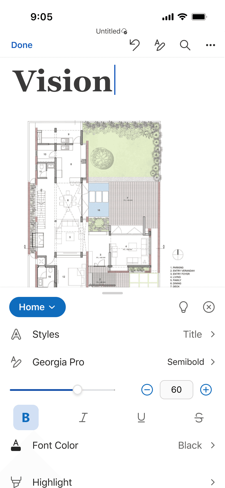
Home Menu Design

Font List Design
After receiving feedback from the designers on my team, I was able to get a feel for what designs got a positive reaction and which didn't. I used the feedback that I received to design new iterations of the font picker experience.

categorize fonts in an accordion?
Could reduce choice overload
Looks outdated and cluttered

provide a preview of the font?
Helps users make the right choice
Takes up a lot of screen space

add a search functionality?
Users can find specific fonts fast
Doesn’t help discover new fonts


Ideation learnings
01
Categorizing fonts can help with font discovery and finding specific fonts.
02
Providing the option to search for a specific font targets unicorn users who have document requirements, such as students.
What's the best way to categorize fonts?
The key here was to find categories for Microsoft Word fonts which would resonate with users and help them to discover fonts which meet their expectations. I started by looking at common font categorizations from Google Fonts, Canva, and Font Book.
Typeface

Feeling/Aesthetic

Intent/Use-case

What users value in a font picker.
I interviewed users to get a better sense of what they look for in a font picker. Here are some common themes that I uncovered.
Recently used fonts
“I tend to use the same 5-7 fonts, I got to this section [recently used] anyways”
Find a font close to their “vision”
“I have a vision in my mind of what I’m looking for, so any help to narrow that down is helpful.”
Visual preview of the font
“My biggest issue is when it doesn’t give you preview of the font. I want to see which fonts I like, with what I’m working with”
Saving time
“I don’t normally know the name of the font. I end up scrolling and it wastes a lot of time”
The font categories were based on the overall 'look' of the fonts, since most users don’t know specific font names, but usually have a vision of what they want. The suggested fonts feature is helpful for users working with templates or pre-designed documents.

Balance


9:05
Untitled
Done
Back
Fonts
Recent
Suggested
Modern
Traditional
Script
Handwritten
Regular
Regular
Medium
Regular
Regular
Regular
Regular
Regular

Font Categories

Final design
With these ideas in mind, I crafted a video and detailed prototype to showcase the redesigned font picker and how it could seamlessly integrate into the existing Word Mobile design. I also demonstrated how styles could be overridden to support this change. The video served as a quick proposal for product managers and developers, allowing me to gather their feedback and insights.


Next Steps
User Testing and Feedback
The design process is always evolving and there's more to come with this project! I'm currently focused on creating high-fidelity prototypes to present in team proposals, allowing developers and product managers to provide feedback on functionality and feasibility. After refining the designs based on their input, I'll move into the user testing phase to gather real-world insights from users. This feedback will guide further iterations, ensuring the final design is intuitive and effective.
Reflection
Ensure you have all the context before the design process.
When I joined the team, the mobile Word experience was undergoing significant changes. It was crucial for me to have a clear understanding of my project, the product, business needs, and ongoing initiatives in the problem space. I made sure to meet with other designers on my team, product managers, and developers to have a better understanding of current efforts being made. Although this took time, it helped to give me a clearer idea of my project and plan how my design would fit into the current system.
Always have form an opinion when sharing with others.
This is a project that I'm leading, and I spent months diving deep into the problem space, learning about the users and the challenges they face. So naturally, I developed a strong perspective on how they behave and what solutions might work. Coming into discussions with a thoughtful opinion helps get everyone on the same page and leads to more relevant conversations.